Earlier this week, I participated in the National Science Foundation (NSF)’s Polar Data Visualization Hackathon in New York City. Remote sensing scientists, glaciologists, visualization experts, and designers all participated in the two-day workshop, held at the Parsons School of Design. The two-day meeting brought together all of these people so that they could harness their backgrounds to discuss how to make possible better visualizations of the Arctic and Antarctic. Sessions discussed topics from the highly technical, like “Open-source Polar Data Workflows with Tangelo Hubs,” to ones more focused on finessing the end product, like how to best display sea ice retreat to general audiences.
The workshop in New York was a sea change from the conference I had attended just a day before in Reykjavik: Arctic Circle, the largest international conference on the future of Arctic development. Northerners like the president of Iceland, the prime minister of Finland, and the former prime minister of Greenland were clear reminders of the fact that the Arctic is home to four million people. Thus, no quote put the two events in starker contrast than when one participant at the NSF workshop asked of the scientists:
“Please just remember to put the cities and towns of the Arctic on the map!”
Whereas Arctic Circle privileged the places, people, and natural resources of the Arctic – the lived environment, if you will – the NSF hackathon focused more on the geophysical features of the region. Sea surface temperature, sea ice extent, ice cores – these were the topics discussed by scientists. Marine-terminating versus land-terminating, hanging glaciers and ice-dammed lakes – such glaciological vocabulary would probably have gone right over the heads of many of the attendees at Arctic Circle. Meanwhile in New York, designers like Jer Thorpe talked about things like the “ooh/ahh factor” necessary for creating successful visualizations – ideas that would have been useful for the few presenters at Arctic Circle who put entire paragraphs of text in Times New Roman on a PowerPoint slide.
Yet while Arctic Circle attendees probably wouldn’t forget to include cities and towns on a map of the Arctic, they might neglect to include other features, like the seasonal dimension of Arctic sea ice. The area isn’t going to be open year-round for shipping, at least not anytime soon, due to the persistence of winter sea ice. Another example could be a map showing bold plans for northern infrastructure, which might overlook including the location of permafrost.
It’s hard to simultaneously depict human and physical phenomena in the Arctic without making a map look too busy. But doing so when possible would emphasize the highly intertwined nature of humans and nature.
While they emphasized different features in the earth’s polar regions, Arctic Circle and the NSF workshop hammered home the point that the Arctic matters. I long for the day when Greenland will be included in maps such as Vision of Humanity’s “Global Peace Index,” below, rather than just being a sorry gray or white featureless triangle on a map with “No Data” as an excuse.

Cryosphere connections
With that in mind, here are some visualizations for the week. The first map shows the cryosphere (sea ice extent in October 2014 and permanent land ice) and global shipping activity in 2004. The second map shows the cryosphere and global flight activity. They’re not really meant to be useful so much as to provoke thought about different ways to visualize the poles and the earth itself. I’ve chosen to use a stereographic projection, which retains the highest accuracy at the poles. I’ve also decided not to include any cities (except for Nuuk, Greenland as a reference point) or land masses, since I am more interested in showing the connections and relations between areas of the globe.

This image shows all the world’s shipping activity from October 2004-2005. The data is provided by the National Center for Ecological Analysis and Synthesis. The Arctic actually has a fair amount of traffic compared to the oceans around Antarctica, where the main route is from Hobart, Tasmania down to the Australian Antarctic Division’s research station. This helps elucidate the differences between the Arctic and Antarctic, especially since many people think of them as one and the same.
Lots of ships sail across the North Atlantic, with a spur leading off to the southwest coast of Greenland. Shipping remains one of the most important ways to supply communities in the Arctic. Even though this mode of transportation can’t occur year-round in the region, shipping is still one of the cheapest means of moving items from one place to another. It’s much cheaper than flying on a global scale, certainly, but especially in the Arctic given the paucity of flight connections (as the next map shows). It’s also interesting to notice the few faint blue lines that cross the Arctic ice cap; some even go into Antarctica at the bottom, and I’m not sure why.
We can also see what happens when we project a map based on the poles: areas far away, like Australia, get massively distorted. The continent appears to be the size of Asia! It’s the Southern Hemisphere equivalent of the Greenland Problem.
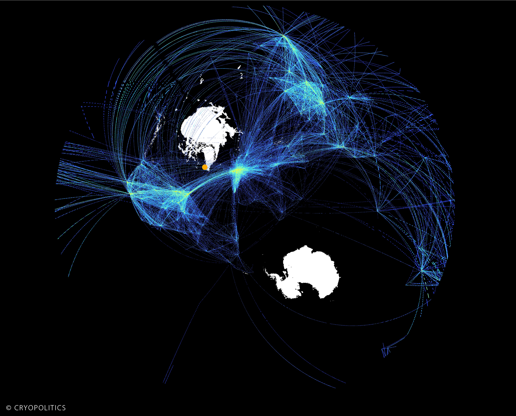
This map demonstrates how the poles are actually quite cut off from the global air traffic network. A lot of flights cross over the Arctic ice cap, since the area provides a shortcut for planes travelling between Asia and North America.* (I’ve written about this topic previously in the context of Arctic search and rescue.)
The image also reminds us how difficult it remains to fly to many Arctic destinations. There aren’t too many blue lines that terminate in the circumpolar north. It is possible to see a little bright spot in the North Atlantic though, to the right of Greenland: that’s Iceland, which has turned into something of an air traffic hub for flights between North America and Europe in recent years.
Note
* The global flight routes depicted are based on great circle distances, which find the shortest line between two points on the earth. A more realistic map of global flight activity would show routes more organized into virtual traffic lanes in the sky.


